---
title: "Chart annotations"
description: "Explain changes, growth, targets, and gaps with chart annotations"
---
Select a chart and use its main toolbar on the right to add an annotation. Grunt supports **Value Jump**, **CAGR**, **Value Line**, and **Level Difference**.
## Value Jump
Use a Value Jump to show a change between two data points. It initially spans the leftmost and rightmost columns. Drag either anchor to another column to choose the comparison.
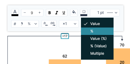
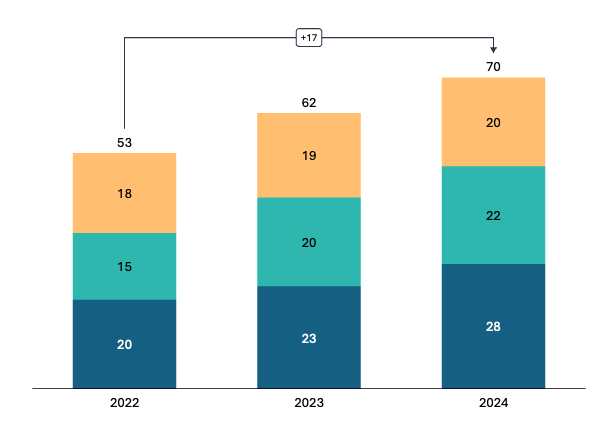 Double-click the arrow to reverse its direction. Click its label to choose a calculation, such as absolute change, percentage change, or both, and adjust its formatting.
 ## CAGR
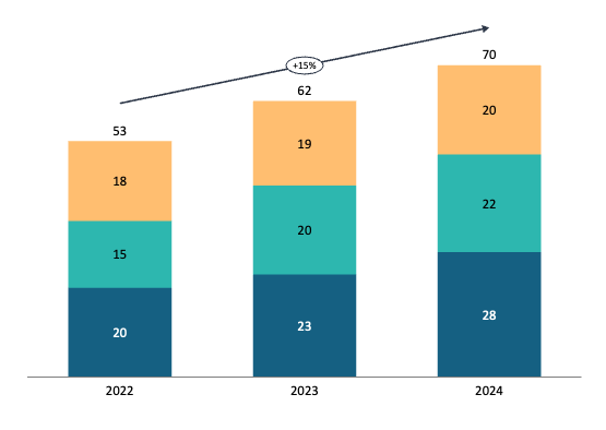
**CAGR** displays the compound annual growth rate between two points. Add it through the same chart toolbar.
Grunt uses chart column positions for an index-based calculation unless it recognizes date labels, in which case it uses a date-based calculation. Click the annotation to inspect its calculation details; hover over it to check the method in the tooltip.
## CAGR
**CAGR** displays the compound annual growth rate between two points. Add it through the same chart toolbar.
Grunt uses chart column positions for an index-based calculation unless it recognizes date labels, in which case it uses a date-based calculation. Click the annotation to inspect its calculation details; hover over it to check the method in the tooltip.
 Check the calculation method before presenting the result, especially if your categories represent irregular intervals.
## Value Line
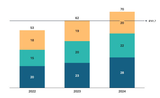
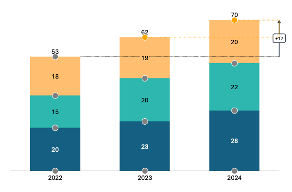
Use a Value Line as a horizontal reference for a target, budget, break-even point, or other benchmark. It makes the values above or below that threshold easier to identify.
Check the calculation method before presenting the result, especially if your categories represent irregular intervals.
## Value Line
Use a Value Line as a horizontal reference for a target, budget, break-even point, or other benchmark. It makes the values above or below that threshold easier to identify.
 ## Level Difference
Use Level Difference to show the gap between two values or series, such as actual versus target. Drag its anchors to position the comparison, then choose a percentage or numeric difference.
## Level Difference
Use Level Difference to show the gap between two values or series, such as actual versus target. Drag its anchors to position the comparison, then choose a percentage or numeric difference.
 For editing the chart's source data, see [Charts](/powerpoint-add-in/user/charts). For connector-based totals and subtotals, see [Waterfall charts](/powerpoint-add-in/user/waterfall-charts).